#7.0 Chart Tab
In the Chart tab, a chart can be created using the data in the table/view selected on the Data Sources tab.
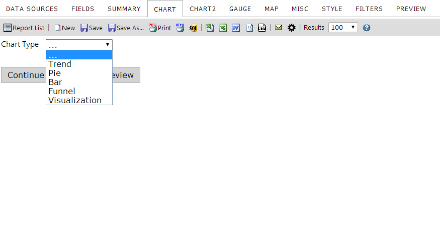
The Charts Tab lets you create different variations of charts, including:
You can have multiple charts in one report or put multiple charts of summary information on a Dashboard to show key business metrics.
##7.1 None Selection
When the chart type is None (…), no chart appears. If you want to remove a chart from a report, choose this option. This option is selected by default.
##7.2 Trend Selection
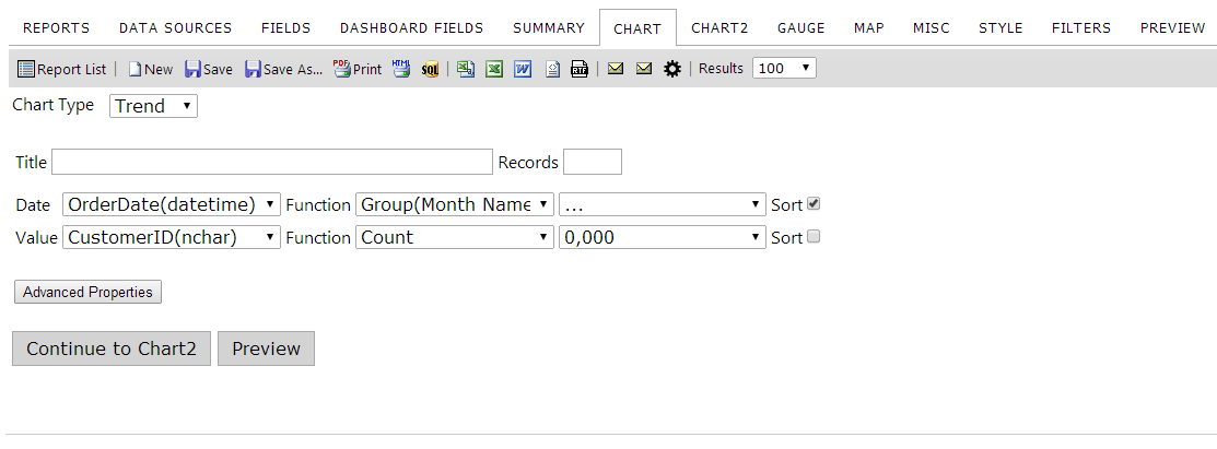
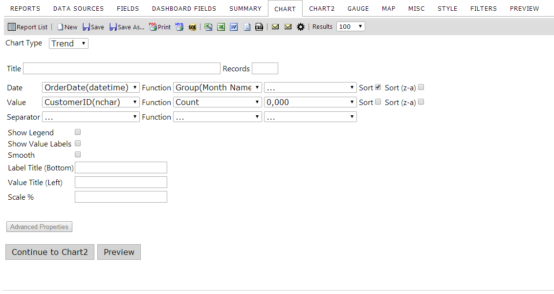
Selecting a Trend chart type will generate a line graph with a number of different options to choose from on your report. There are two modes to select various options from: a simple view and an advanced view.
Basic Trend Chart Tab
Advanced Trend Chart Tab
Note: Some options may not be available with certain charting engines. For a list of charting engines and what they do, click here.
The table below describes the features of the Trend chart type selection.
| Feature | Description |
|---|---|
| Title | This text box allows the user to add a title to the chart. It will appear above the chart. |
| Records | this text box allows the user to specify the maximum number of records to include in the chart data. |
| Date | Allows the user to select the time metric for the chart. The options in this field are detected automatically from your selected data sources. |
| Value | Allows the user to select the data metric for the chart. This can be filled with any numeric data. |
| Separator | Allows the user to select the metric that the chart will separate data by. |
| Show Legend | Displays a legend below the trend chart color coded to the separator values displayed. |
| Show Value Labels | Checking this box will display the value of the data at each increment mark on the chart. |
| Smooth | Checking this box will display smooth curves on the trend chart instead of straight lines. |
| Label Title (Bottom) | This box lets you specify the text of the label that runs across the bottom of the chart. |
| Label Title (Left) | This box lets you specify the text of the label that runs across the left of the chart. |
| Scale % | Allows you to scale your chart to a percentage of the original size. |
###7.2.1 Creating a Basic Trend Chart
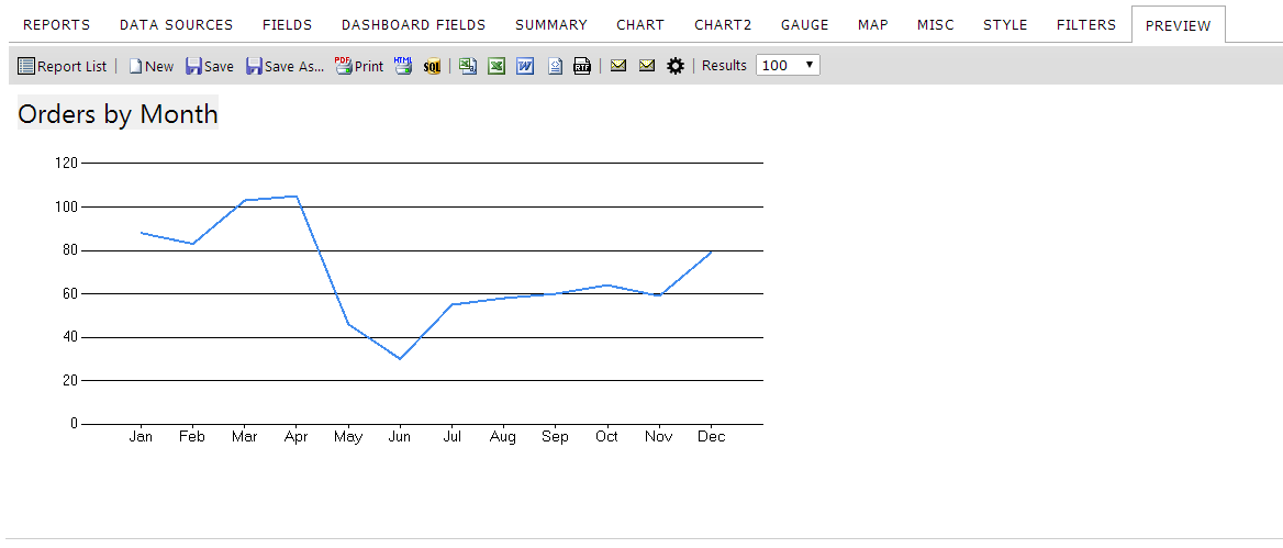
This tutorial will demonstrate how to create a Trend chart demonstrating the grouping function "Orders by Month". You can use our demo site to follow along with the instructions below.
Instructions
- From the ReportList.aspx page, click on the arrow icon next to New and click Report from the dropdown menu. When the page redirects, we need to select a data source.
- Click on the Data Sources tab. Then click on the drop down box and choose Orders.
- Click on the Chart tab. This is where we create charts.
- Click on the Chart Type drop down box and choose "Trend" for the chart type.
- Click on the Date drop down box and select OrderDate for our date field.
- For the Date function select Group (Month Name) from the drop down box.
- Click on the Value drop down box and select OrderID for our value field.
- For the Value function select Count Distinct from the drop down box.
- Click on the Preview tab so you can view the report. Let's add a title to this report.
- Click on the Misc tab. In the Title text box enter "Orders by Month".
- Click the "Preview" tab. Now the Report has a title. Let's save it.
- Click on the Save As tool bar button, name your report and enter the category you want the report to be shown under. Click OK. The Izenda report is saved. You may now view the report by navigating to it from the Report List page.
###7.2.2 Creating an Advanced Trend Chart
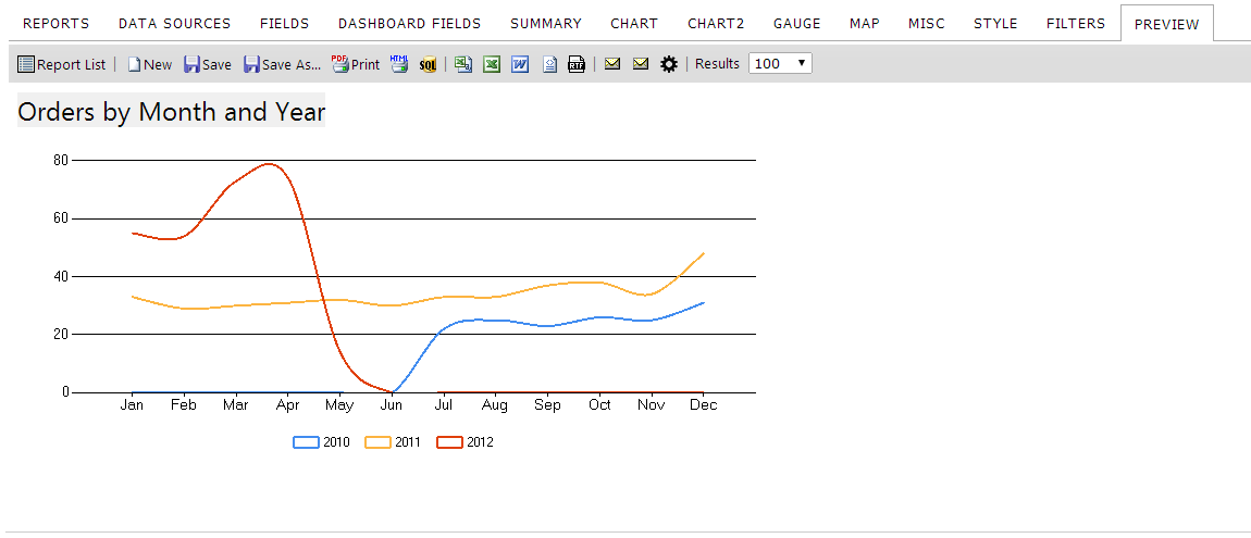
In this example, we will modify the trend chart created in 7.2.1 above by separating the data by year and smoothing out the graph.
Instructions
- Edit your newly created report. You can do this by selecting the category you stored it under on the Report List and clicking the pencil icon at the bottom right corner of the preview panel.
- Click on the Chart tab.
- Click on the Show Advanced button.
- Click on the "Separator" drop down box and select OrderDate.
- Click on the "Separator" function dropdown box and select Group (year). This is how the data will be separated.
- Notice that the "Show Legend" check box is selected.
- Click on the Smooth check box.
- Click the Preview tab. Now the Trend Chart has been enhanced and separated by year. Let's update the title for this report.
- Click on the Misc tab.
- In the Title text box enter "Orders by Month and Year".
- Click the Preview tab. Let's Save it.
- Save your report
- Click on the Save toolbar button. This will overwrite the old report with the new information you added OR
- Click on the Save As toolbar button to choose a new title/category to save your new report under.
##7.3 Pie Selection
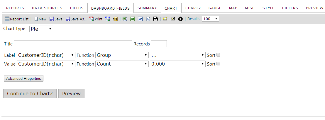
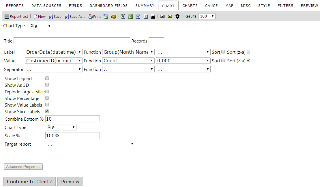
The image below shows the Pie Chart Type selection options on the Chart tab.
Basic Pie Chart Tab
Advanced Pie Chart Tab
Note: Some options may not be available with certain charting engines. For a list of charting engines and what they do, click here.
The table below describes the Pie chart selection options. You can use our demo site to follow along with the instructions below.
| Feature | Description |
|---|---|
| Title | This text box allows the user to add a title to the chart. It will appear above the chart. |
| Records | this text box allows the user to specify the maximum number of records to include in the chart data. |
| Label | Allows the user to select the field used for the label of each slice of the pie. The options in this field are detected automatically from your selected data sources. |
| Value | Allows the user to select the data metric for the chart. This can be filled with any numeric data. |
| Separator | Allows the user to separate their data into multiple charts based on a field value. |
| Show Legend | When checked, this displays a color-coded legend below the chart. |
| Show As 3D | When checked, this displays the chart in 3D. |
| Explode Largest Slice | When checked, this will cause the piece with the highest percentage to be separated from the rest of the pie. |
| Show Percentage | When checked, this will display the percentage of the pie each section represents. |
| Show Value Labels | When checked, this will display the numeric value of each slice. |
| Show Slice Labels | When checked, this will display the text value of each slice. |
| Combine Bottom % | A percentage entered as a whole number (i.e. an input value of 10 = 10%) that will combine entries with the smallest percentages until it meets or exceeds the given amount. |
| Chart Type | A dropdown where the user can select whether the chart will be a pie or a doughnut. |
| Scale % | Allows the user to enter the percentage to scale the chart to. Entering 100% will yield the same result as putting nothing here. |
| Target report | Allows you to specify a subreport to drilldown to. Drilldown reports will open in a new browser tab. |
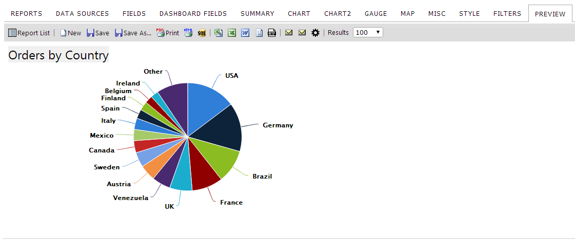
###7.3.1 Creating a Basic Pie Chart
Instructions
- From the ReportList.aspx page, click on the arrow icon next to "New" and click "Report" from the dropdown menu. When the page redirects, we need to select a data source.
- Click on the Data Sources tab. Then click on the drop down box and choose Orders.
- Click on the Chart tab. This is where we create charts.
- Click on the "Chart Type" drop down box and choose Pie for the chart type.
- Click on the Label dropdown box and select ShipCountry for our label field.
- For the Label function select Group from the drop down box.
- Click on the "Value" drop down box and select OrderID for our value field.
- For the Value function select Count Distinct from the drop down box. Let's sort the values so the countries with the most orders will be together.
- Click on the Sort (z-a) checkbox for the value field.
- Click on the Preview tab so you can view the report. Let's add a title to this report.
- Click on the Misc tab.
- In the Title text box enter "Orders By Country"
- Click the Preview tab. Now the Report is Titled. Let's Save it.
- Click on the Save As… toolbar button, name your report, and enter the category you want the report to be shown under. Click OK. The Izenda report is saved. You may now view the report by navigating to it from the Report List page.
###7.3.2 Creating an Advanced Pie Chart
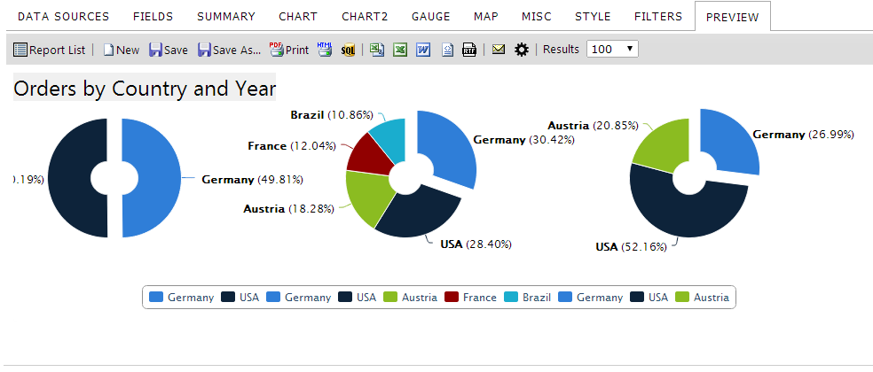
In this lesson, we will modify the pie chart created above by separating the data by year so we can see which countries had the most orders each year.
Instructions
- Edit your newly created report. You can do this by selecting the category you stored it under on the Report List and clicking the pencil icon at the bottom right corner of the preview panel.
- Click on the Chart tab.
- Click on the Value dropdown box and select Freight for our value field and Sum for our function and $0.00 for our format.
- Click on the Advanced Properties button.
- Click on the Separator drop down box and select OrderDate
- Click on the Separator function dropdown box and select Group(Year). This is how the data will be separated. Next, let's limit the number of records shown to 10.
- Click on the Records textbox. Enter 10. Next, let's add a legend.
- Click on the Show Legend check box to select it. Now, let's explode the largest slice from each year.
- Click on the Explode Largest Slice check box. Now, let's add percentages to the pie graph.
- Click on the Show Percentage check box. Now, let's also change the type of pie chart.
- Click on the Chart Type drop down box and select Doughnut.
- Click the Preview tab. Now the Pie Chart has been enhanced to show the countries with the most orders separated by year. Let's update the title for this report.
- Click on the Misc tab.
- In the Title text box enter "Orders By Country and Year"
- Click the Preview tab. Let's Save it.
- Save your report
- Click on the Save toolbar button. This will overwrite the old report with the new information you added OR
- Click on the Save As toolbar button to choose a new title/category to save your new report under.
##7.4 Plot Selection
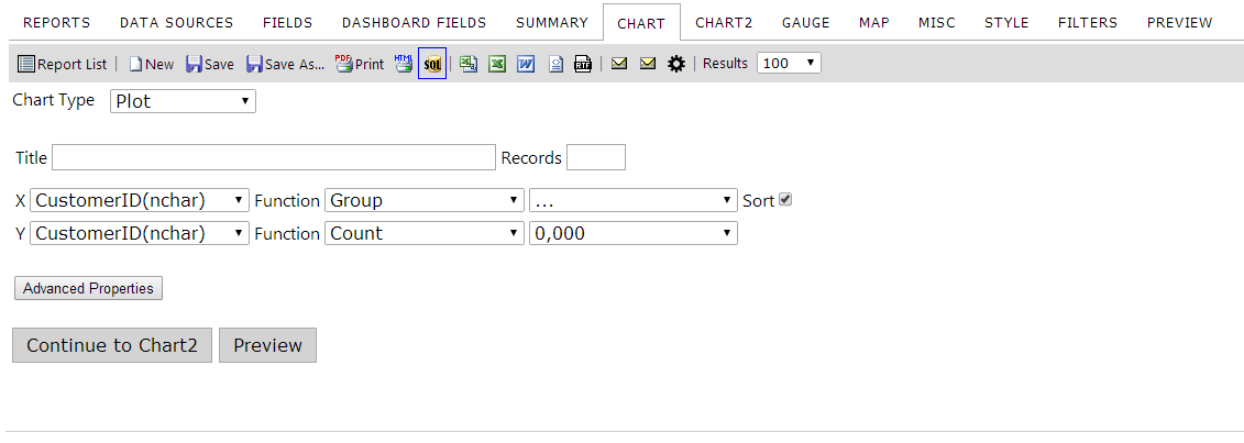
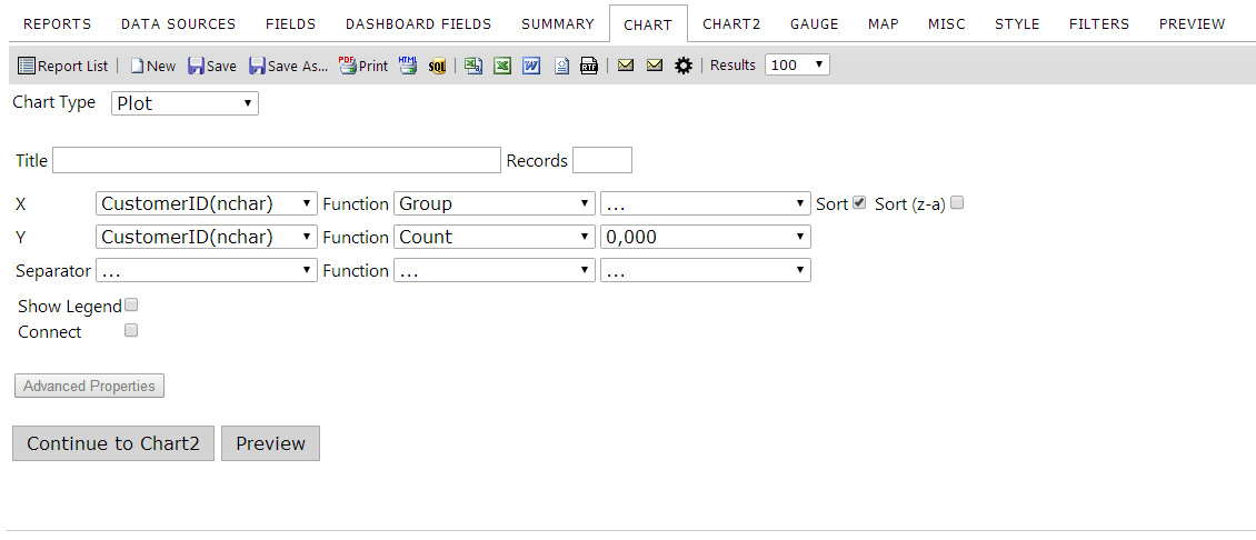
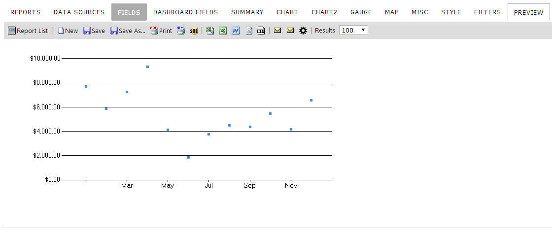
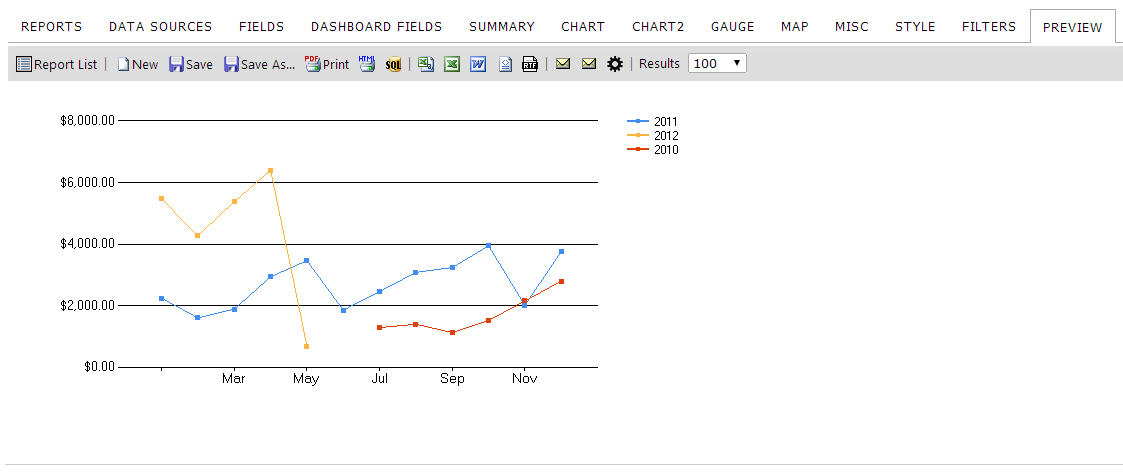
Selecting a Plot chart type will generate a scatter plot chart. This acts very similar to the trend chart but has a few key differences.
Basic Plot Chart Tab
Advanced Plot Chart Tab
Note: This graph is not available with certain charting engines. For a list of charting engines and what they do, click here.
The table below describes the features of the Plot chart type selection.
| Feature | Description |
|---|---|
| Title | This text box allows the user to add a title to the chart. It will appear above the chart. |
| Records | this text box allows the user to specify the maximum number of records to include in the chart data. |
| X-axis dropdown menu | Choose any field from the dropdown for the X-axis. Generally, this will be a numeric or date field. |
| Y-axis dropdown menu | Choose any field from the dropdown for the Y-axis. Generally, this will be a numeric field. |
| Separator | Allows users to separate their data into multiple plots on the same graph. |
| Show Legend | When checked, this will dislay a color-coded legend next to the chart. |
| Connect | When checked, this will draw connecting lines between the plot points, much the same way a trend chart would. |
| Auto-Scale | When checked, this will scale the graph dynamically to your data range. |
| Scale% | Scales the size of the graph to the percentage entered. No input will default to 100%. |
Below you can see the results of the plot chart type
Basic
Advanced
##7.5 Bar Selection
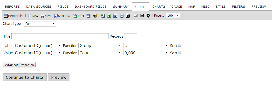
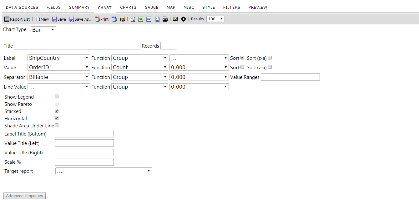
The images below show the Bar Chart Type selection optiosn on the Chart tab.
Basic Bar Chart Tab
Advanced Bar Chart Tab
Note: Some options may not be available with certain charting engines. For a list of charting engines and what they do, click here
The table below describes the Bar chart selection options. You can use our demo site to follow along with the instructions below.
| Feature | Description |
|---|---|
| Title | This text box allows the user to add a title to the chart. It will appear above the chart. |
| Records | this text box allows the user to specify the maximum number of records to include in the chart data. |
| Label dropdown menu | Allows the user to select a field to use as the x-axis data. |
| Value dropdown menu | Allows the user to select a field to use as the y-axis data. |
| Separator | Allows the user to select a field to separate the data into multiple groups with. |
| Value Ranges | This acts like the Advanced box's Value Ranges item. It will use the specified replacement values for given ranges of data. The number of ranges should correspond to the number of groupings you have in your data. |
| Line Value | When Show Pareto is checked, this will set an alternate metric to display on the trend line. |
| Show Legend | When checked, this will display the values supplied with the Separator field as a legend below the chart. The colors for the legend will correspond to the colors shown in the chart. |
| Show Pareto | When checked, this will display a trend chart superimposed upon the bar chart. |
| Stacked | When checked, this will cause the bars to be stacked as long as they're in the same grouping (determined by the value of the Separator dropdown). Otherwise, they are shown side-by-side. |
| Horizontal | When checked, this will rotate the bar chart 90 degrees. The bars will animate from left to right. They animate from bottom to top normally. |
| Shade Area Under Line | When Show Pareto is checked, this will cause the entire area underneath the trend line to be shaded semi-transparently. |
| Label Title (Bottom) | This text box allows the user to label the bottom section of the chart, allowing viewers to more easily read the data. |
| Label Title (Left) | As with the entry above, but for the Left chart margin. The data displayed in the left margin describes the bar portion. |
| Label Title (Right) | As with the entry above, but for the Right chart margin. The data displayed in the right margin describes the trend portion. |
###7.5.1 Creating a Basic Bar Chart
Instructions
- From the ReportList.aspx page, click on the arrow icon next to New and click Report from the dropdown menu. When the page redirects, we need to select a data source.
- Click on the Data Sources tab. Then click on the drop down box and choose Orders.
- Click on the Chart tab. This is where we create charts.
- Click on the "Chart Type" drop down box and choose Bar for the chart type.
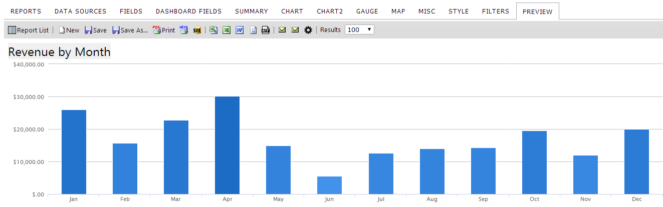
- In the Title text box enter "Revenue by Month".
- Click on the Label dropdown box and select OrderDate for our label field.
- For the Label function select Group(Month Name) from the drop down box.
- Click on the "Value" drop down box and select Freight for our value field.
- For the Value function select Sum from the drop down box.
- For the Format dropdown box, select $0.00(money). Let's sort the values so the months are in sequential order.
- Click on the Sort checkbox for the value field.
- Click on the Preview tab so you can view the report. Let's Save it.
- Click on the Save As… toolbar button, name your report, and enter the category you want the report to be shown under. Click OK. The Izenda report is saved. You may now view the report by navigating to it from the Report List page.
###7.5.2 Creating an Advanced Bar Chart
Instructions
- Edit your newly created report. You can do this by selecting the category you stored it under on the Report List and clicking the pencil icon at the bottom right corner of the preview panel.
- Click on the Chart tab.
- Click on the Advanced Properties button.
- Click on the Separator drop down box and select OrderDate
- Click on the Separator function dropdown box and select Group(Year). This is how the data will be separated.
- Click on the Line Value dropdown box and select UnitPrice.
- Click on the Line Value function dropdown box and select Average.
- Click on the Show Legend check box to select it. Now, let's also add a trend chart to this graph.
- Click on the Show Pareto check box. Now, let's show the columns stacked on top of each other.
- Click on the Stacked check box. Now, let's label the other sections of the chart.
- In the Label Title (Bottom) text box, enter "Sales Month".
- In the Value Title (Left) text box, enter "Total Revenue".
- In the Value Title (Right) text box, enter "Average Price per Unit".
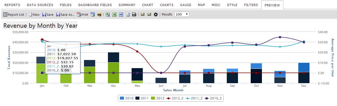
- Click the Preview tab. Now the bar chart shows revenue by month and year as well as the average unit price for each month. Let's update the title for this report.
- In the Title text box on the Chart tab, enter "Revenue by Month by Year".
- Click the Preview tab. Let's Save it.
- Save your report
- Click on the Save toolbar button. This will overwrite the old report with the new information you added OR
- Click on the Save As toolbar button to choose a new title/category to save your new report under.