
#Customize Chart Colors
#Basic Charts ##Purpose
Customizing the chart colors allows you to inject a bit of your own branding, or any other color scheme, into Izenda's reports.
##Example
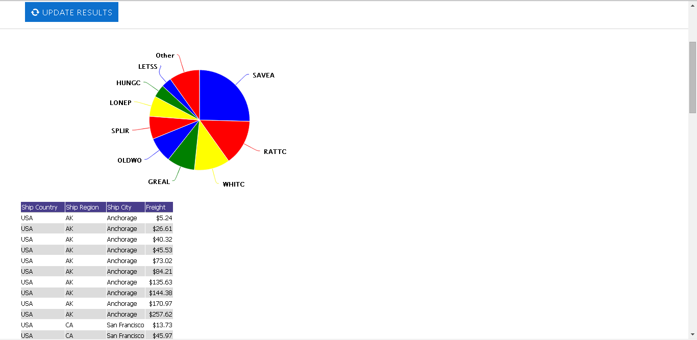
This image depicts a pie chart with custom colors set to Blue, Red, Yellow and Green.
##Implementation
The following code snippet should be added to the default.master page in a webforms implementation, or in Views/Shared/_SiteLayout.cshtml in an MVC implementation:
<script type="text/javascript">
  htmlChartColors = ['Blue', 'Red', 'Yellow', 'Green'];
</script>
This would achieve the color scheme from the example image above.
Note: you will need a recent copy of the Izenda core product. This ability was added in 6.7.0.264, and can be downloaded here
You can also use more complex code:
public override void CustomizeChart(object chart)
{
	var chartContent = chart.ToString();
	int startIndex = chartContent.IndexOf("id='") + 4,
		endIndex = chartContent.IndexOf("'", startIndex);
	var chartid = chartContent.Substring(startIndex, endIndex - startIndex);
	var scriptContent = @"
		jq$(document).ready(function () {
			var colors = Highcharts.getOptions().colors; // you can use any colors here (array of colors)

			window.izenda = (window.izenda || {});
			window.izenda.customcolors = (window.izenda.customcolors || {});
			window.izenda.customcolors.u = (window.izenda.customcolors.u || {});
			window.izenda.customcolors.i = (window.izenda.customcolors.i || 0);

			function getColorByName(name) {
				if (!window.izenda.customcolors.u[name]) {
					window.izenda.customcolors.u[name] = colors[window.izenda.customcolors.i % colors.length];
					window.izenda.customcolors.i++;
				}
				return window.izenda.customcolors.u[name];

				/*
					// or you can use something like this:
					if(name == 'Company A')
						return '#FF0000';
					if(name == 'Company B')
						return '#00FF00';
					// ...
				*/
			}
			var chartid = jq$('#" + chartid + @"').data('highchartsChart');
			var chart = Highcharts.charts[chartid];
			if (jq$(chart.container).is(':visible')) {
				jq$.each(chart.series, function (i, group) {
					jq$.each(group.data, function (i, item) {
						item.color = getColorByName(item.name);
						item.connector.stroke = item.color;
						item.connector.element.style.stroke = item.color;
					});
					group.redraw();
				});
			}
		});";

	System.Text.StringBuilder csb = (System.Text.StringBuilder)chart;
	csb.Append("<script>" + scriptContent + "</" + "script>");
}
#Visualizations
Visualizations use the D3 javascript library (http://d3js.org/), which means that to customize the colors used in a specific visualization you must modify that feature's base code. There is no global setting to change the colors used in a visualization, as each visualization has its own independent codebase.
##Example
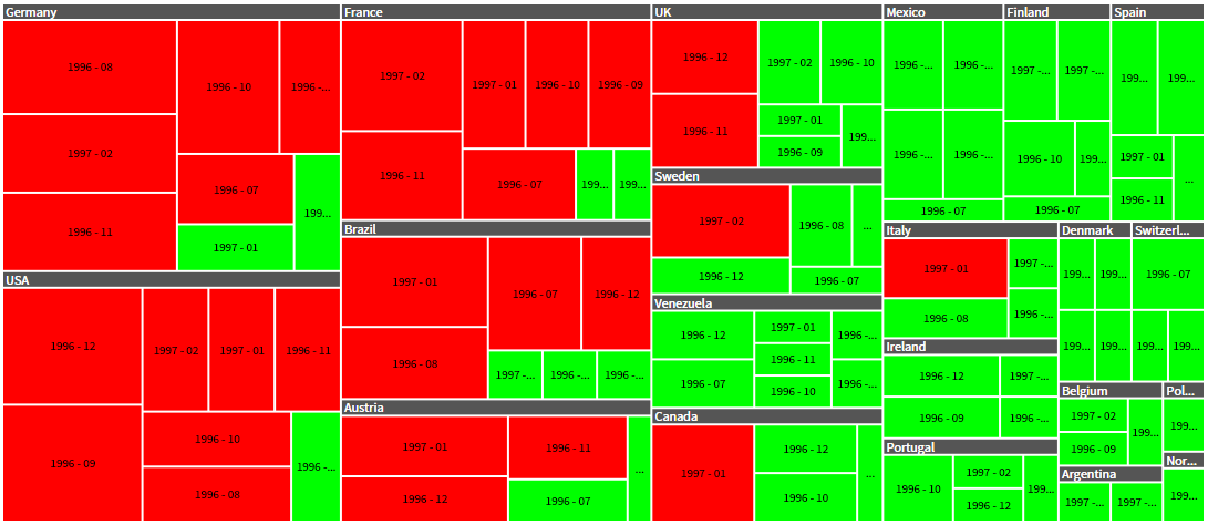
Here, the Heatmap visualization has been customized to use two colors - red and green.
##Implementation
Here we have customized the Color function in the base visualization definition, located by default at .\Resources\Vis\Rectangular\Heatmap\View.html
var items = vis.getItems(), sum = 0, avg = 0;
for (var i = 0; i < items.length; ++i) {
	sum += vis.unitValue(items[i], s.props.metric);
}
avg = sum / items.length;

function color(d) {
	// val - value of the current rectangle.
	var val = vis.unitValue(d, s.props.metric);

	return (val > avg) ? "#FF0000" : "#00FF00";
}
The basic steps involved here are:
- Determine the value of each item
- Establish an average of all values in the dataset,
- Color each value red (#FF0000) if it is above the average, and green (#00FF00) if it is below.